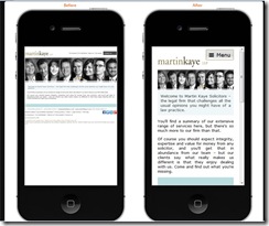
 DBS have added a mobile website simulator to our website to showcase some of our clients who now have mobile websites, and to illustrate the difference having a mobile website makes to the way your site is viewed on a phone. If you go to our mobile websites page you will see a gallery at the bottom of the page with clickable images of a sample of some of our clients. If you click through you will see how their site looked before we made it a mobile website, and how it now looks, and what a difference it makes. Having a website which looks good and is easy to use on both a traditional PC as well as a mobile device is vital because in recent years more and more people have started using internet “on the go”. It is predicted that surfing the web on a mobile device will overtake surfing the web on a PC by 2014. There is therefore a high chance that your clients and potential clients will be viewing your site and considering your services whilst sat on the train, in a cafe or at home using their iPad, iPhone, tablet or smartphone. It doesn’t make a good impression if the website they view doesn’t display properly on their mobile device, and if they have to scroll around or pinch the screen to view your information. Chances are they will end up getting fed up and look at the website of a competitor whose site is mobile friendly. If you are interested in having your website made mobile friendly, contact David Clarke on FREEPHONE 0800 988 8366 for more information.
DBS launches mobile website simulator
DBS have added a mobile website simulator to our website to showcase some of our clients who now have mobile websites, and to illustrate the difference having a mobile website makes to the way your site is viewed on a phone. If you go to our mobile websites page you will see a gallery at…


