A new website is a large investment and something that needs to be planned and carried out carefully. Here are 13 common mistakes that can ruin your website.
Getting too complicated
It can be a common mistake to get carried away with different patterns and layouts on your website. Technology lets you create extremely sophisticated websites now – full of videos, amazing animation etc but you have to pick and choose accordingly as simplicity can go a long way. Whilst you want to be different to your competitors, don’t let it sacrifice your website design too much. There is a reason why websites have menus at the top of the screen for example. It’s to make the the customer experience simple and user friendly. Going against the grain and being too out there could cost you leads and conversions.
Not choosing the right colours
Whilst you don’t have to choose the same colours as everyone else (being a bit different in these scenarios can help you stand out) just be careful which colours you choose, especially when it comes to text on a coloured background. The last thing you want is text that people struggle to read. Not only is colour contrast something that Google looks at when assessing a website, it can really put users off and could make them leave. Also make sure the colours you choose harmonise with your branding and logo.
Wasting space at the top of a page
A lot of users will inevitably not scroll down and read an entire web page which is why the content that is above the fold (the information that you can see before you scroll) is vital. Do not waste this space on banners that are too large or information that is not relevant. Always lead with your key information to ensure every person that lands on the page reads this without the need to scroll down.
Not considering mobile first
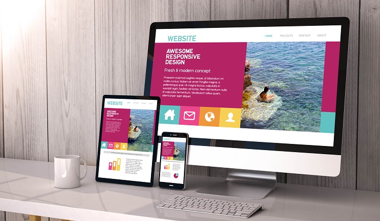
There is now no reason why you should not be planning your website with a mobile first approach. A significant proportion, if not the majority, of your website visits will be coming from mobile devices as opposed to desktop so it is imperative that your website works well on mobile. Not only does this help provide a better online experience for visitors, it is an important factor for search engines and you will be penalised if your mobile experience is bad.
Using PDFs too much
Whilst there is a time and place for PDF documents (for example if you provide a website visitor with an option to download a PDF version of your content), you should not have PDF’s as your default or go to option. Instead, have as much information on the website itself rather than hidden in PDFs. This will help improve the readibaility of your website when search engine crawls your site. It will also benefit your SEO.
Make it obvious where people should click.
Always have your user in mind when designing web pages. One thing users will get annoyed at is if they click assuming something will happen but then it doesn’t. Website testing is a vital stage to help with this. Monitor how a new visitor behaves as this can help highlight where they are automatically clicking. Once you know where people are wanting to click, ensure the right part is clickable. Don’t just make the words themselves clickable, ensure the area around it is hyperlinked and that it is obvious and easy to click on mobile devices.
Break up pieces of text
Don’t make your website full of huge sections of text. Often users want to find the information in a quick and seamless way and don’t want to have to read pages and pages of text. A quick way to make your text appear less daunting to read is to break it up into short paragraphs, use headers, bullet points and make the most of white space. All of these techniques help the reader digest the information easier.
Inconsistency
Your website needs to feel the same no matter what page you are on. If you get to a page that is suddenly a different font, different colour scheme, different tone of voice etc, it can cause confusion to the customer and won’t be on brand. Having a website that is consistent throughout creates a nicer, calmer user experience.
Poor Navigation
Think about your navigation and website menu carefully. Use terms that people are familiar with and keep your pages organised into relevant groups. Think logically and ensure that your customers can clearly navigate to the pages they need to in order to carry out what they want to do (whether this be purchasing a product, filling out a form or contacting the company).
Hidden contact information
Never make it difficult for people to get in touch with you. You might not want people to ring up but that doesn’t mean you should hide your information. People like to be able to get in touch with a company if they need to, so make sure they can, even if you just place it in the footer or on a dedicated “contact us” page.
If you do take orders over the phone then include your number at the top of every page rather than hiding it at the bottom. Do the same, if you are encouraging people to email you.
Be open and honest about pricing
Many websites tell you all about their products and services but as soon as you want to know how much it costs, you can’t find the information. Whilst the company may think hiding this information will lead the customer to get in touch with them, this isn’t always the case. The truth is, they may opt for a competitor who is honest about their pricing from the start. Remember, you don’t have to be specific if the pricing varies, you just need to provide a starting figure so that the user knows whether you are in their price range or not. This will help manage their expectations and will also mean you will get leads and enquiries that already know what to expect to pay which is great for you.
Have clear call to actions
Each page of your website should have a clear call to action. You want to take your user on a journey through your website that is as easy as possible. So make it clear what you want the user to do and do not give them too many choices. Whilst this may be tempting as it is providing customers with many options to suit different needs, it can actually lead to choice stress- people with too many choices struggle to decide and can just decide to leave. Instead, you want to guide them.
Asking for too much information
Having forms on your website is great for data capture (for example when downloading an ebook) and also a good way for people to get in touch with you. However, you have to be careful when asking for information. Yes, you need the vital information such as name and contact details but don’t ask for too much additional information. Whilst the more data you have the better, don’t make too many fields compulsory as it can end up scaring away prospects.
These are just some of the common mistakes people can make on their website. The good news is they can all easily be avoided. The key is to ensure that your user has the best online experience possible. That they can get always find the information they want and can follow out their intentions with the minimal amount of effort.
At DBS Digital, our Website Design Services are tailored to help you avoid these common website pitfalls, ensuring a seamless online presence. Reach out to our team today for further information.


