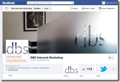

Facebook first introduced its cover photo in September 2011 when it introduced Facebook Timeline. It was a major change to the way Facebook pages looked, and it gave owners of Facebook pages the chance to tell people looking at their page something about themselves. They say that a picture says a thousand words, and in this case it is certainly true that the large banner across the top of your page is the most viewed part of your Facebook page, so by keeping it interesting, colourful and creative it can say a lot about you as an individual or as a business.
Not to be outdone by Facebook, Google+ introduced their own version of the cover photo in April of this year, giving a bit of colour and excitement to a still not particularly interesting social networking site.

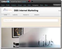
Now, a little late to the game, both Twitter and LinkedIn have both launched their own versions of the cover photo, with the photo for LinkedIn brightening up previously uninspiring company pages, as well as giving more prominence to status updates, and Twitter incorporating the name, 160 character bio, website, location, profile photo and cover photo all into one header in September 2012.
Therefore, the 4 big social media sites have all adopted cover photos, moving towards making social media more visually appealing, creative, artistic and mobile friendly. If you haven’t updated your profiles yet, we highly recommend that you do, as it makes your page far more interesting, and fills the otherwise blank space that the sites leave for you! If you need any help or advice with your social media then contact DBS as we offer a full social media set up and management service.


